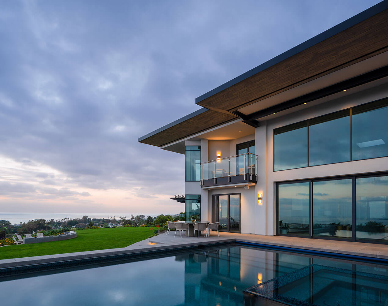
Choosing Paint Colors & Decorating with Color
Picking paint colors, and creating a color scheme for your home can be one of the most difficult tasks in decorating. However, it does not have to be! As long as you have a few rules of thumb and education in color, you will be fine! My biggest advice: Don’t be afraid to take a risk. Are you unsure if those burnt orange accent chairs will go with your sage wall? Well, try it! You won’t know unless you try. Also, it always tends to be those things you aren’t sure about, that end up being the best element in the room.
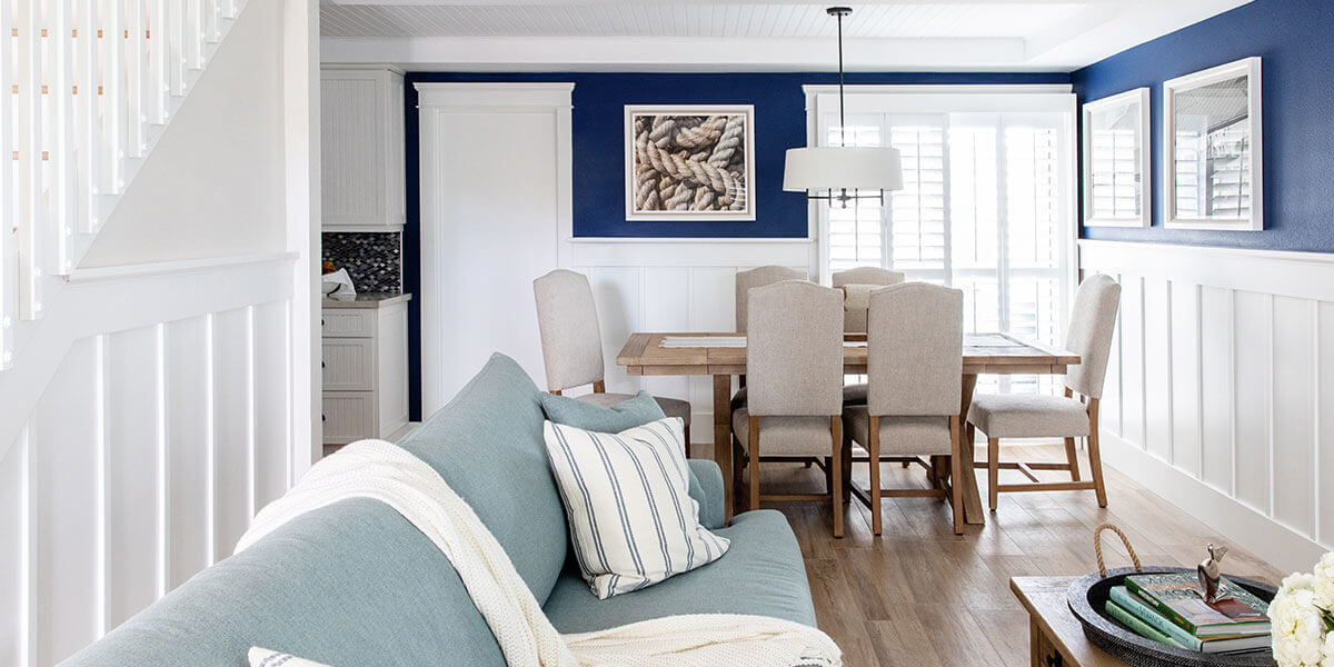
So, here is a brief summary of color theory: Color harmony in a space is the ultimate goal, which is the pleasing arrangement of colors, creating a balance in the visual experience. This can be achieved through several types of color schemes. Analogous colors are any three colors that are side by side on a 12 part color wheel. Contrasting is adding a pop of color from the opposite side of the wheel. We typically call these our “accent colors”. Monochromatic is simply just tints, tones, and shades of a single hue (everything of the same color). Now that you’re an expert in color theory it’s time to get started!
1. First off, keep in mind that when using a fan deck, the middle color is the true color and then moving outwards (up or down) is either adding black and/or white or just increasing/decreasing the pigment in the original color.
2. Be sure to consider variety in your space. If you have brown floors, furniture, and trim, mix it up by choosing a paint, or other pieces of furniture with gray or black undertones to avoid too much of the same thing. Black, white, grey, and brown are all considered neutrals so feel free to mix them in accordingly in your space. You do NOT have to stick to just one of them. Boring…
2. A small paint color sample can look extremely different covering a complete wall. To remedy this, paint the samples you are considering in a sizable patch on your wall (2’x2′ squares do the trick). Be sure to do this on a shadowed wall as well as a wall that gets natural light, as the color will look different depending on light quality. Look at it for 1-2 days, noticing the changes in color through the hour changes.
3. Remember to consider your lighting. Different types of bulbs flatter different paint colors and shades. What may look great under an incandescent light source might not look the same under a fluorescent one. To get an accurate view of the actual color, take it outside into natural light.
4. Consider VOCs (volatile organic compounds) when choosing a brand. VOCs are solvents that get released into the air as the paint dries and even long after it dries. These compounds can cause headaches and have also been linked to other health issues. Luckily, a wide range of low VOC or VOC free options are now available from many brands. We typically use Dunn Edwards; they carry a great no-VOC product. Considering these options is especially important for spaces with small children, pregnant women, the elderly, people with allergy issues or anyone that wants to improve their overall indoor air quality.